Building Flexible Illustration Systems With Today’s Tools
Creative alignment, without losing momentum

Where Visual Identity Breaks Down
Most startups put real energy into designing a great product and defining a brand. There’s usually a homepage, a logo, a voice, maybe some illustration—but beyond those core pieces, things get murkier. As content, campaigns, and internal needs start to grow, visual consistency tends to fade.
Not because anyone’s cutting corners. It just happens. Everyone’s busy, priorities shift, and design work outside the product often gets split between multiple teams or handled in a rush. The result is a brand that looks refined in some places, but underdeveloped in others.
That’s where a lot of companies find themselves. Wingspan was one of them.
They had a strong brand and a refined product experience—but they didn’t have a consistent illustration system, especially for editorial and marketing work. They needed a way to scale their visual language without reinventing it every time.
That’s where I came in.


Wearing All the Hats
In most early-stage startups I’ve worked with, I’ve been the only designer. That meant designing the product, defining the brand, creating marketing assets, building pitch decks, making swag, and writing copy when needed—aka when no one had it. It’s a lot, but I’ve always been drawn to that kind of role.
Part of it is how my brain works. ADHD has made me naturally curious and constantly shifting gears. In a fast-paced environment where no two tasks are the same, that can be a strength. I like being able to move between strategy and detail, between product and brand, between creative concepting and execution.
But one thing I’ve seen again and again is how easily product and marketing become disconnected. Not intentionally—just structurally. Different teams, different timelines, different tools. The product has a design system, the marketing team has templates, and brand consistency ends up murky.
And when illustration isn’t part of the system, it’s usually the first thing to drift. It’s handled case by case, or skipped entirely. You can feel the break: visuals that don’t quite match the tone, that don’t evolve with the brand, that feel like one-offs.
That’s the gap I’ve been working to close—most recently with Wingspan, by creating an illustration system that could stretch across the brand and keep things feeling smart, modern, and intentional.

A System That Scales
The project started simply enough: helping out with a few illustrations. But it quickly became clear there was a bigger opportunity—to rethink how the brand showed up visually across all kinds of content. Wingspan already had a smart, minimal feel, but that polish didn’t carry through to everything. There was a gap between the refined product experience and the visuals used in places like the blog, campaigns, and decks.
When I came in, the goal wasn’t just “make some blog images.” It was about finding a visual layer that could stretch further—something flexible, recognizable, and still elevated. The kind of system that could support the team as things scaled, without requiring a full design lift every time.
We knew we didn’t want to fall into the same visual clichés that show up everywhere else. From the beginning, the goal was to create something distinct. I explored a few directions early on and shared rough concepts with the team. The feedback helped shape the tone—less generic, more intentional. Something that stood out, but still fit—distinct, but still on-brand.
Rather than creating one-off illustrations, I focused on building a system. A visual language we could reuse and adapt without it feeling templated or stiff. Something that could evolve with the brand.


Taking Shape
What made this all possible, honestly, was the new wave of generative tools. A few years ago, it would’ve taken weeks to dial in something this nuanced. Now, I could move at the pace of my imagination—experimenting, adjusting, and refining until it felt just right. The tools were fast, but the choices still had to be intentional. That part stayed human.
At the time, I was exploring a newer Midjourney feature: SREFs—style reference codes that help guide consistency across outputs. I found a massive library at srefs.co and started collecting ones that felt right. I wasn’t hunting for a single look—I was layering styles, textures, and moods to see what would emerge. That blend of references helped push things in unexpected directions.


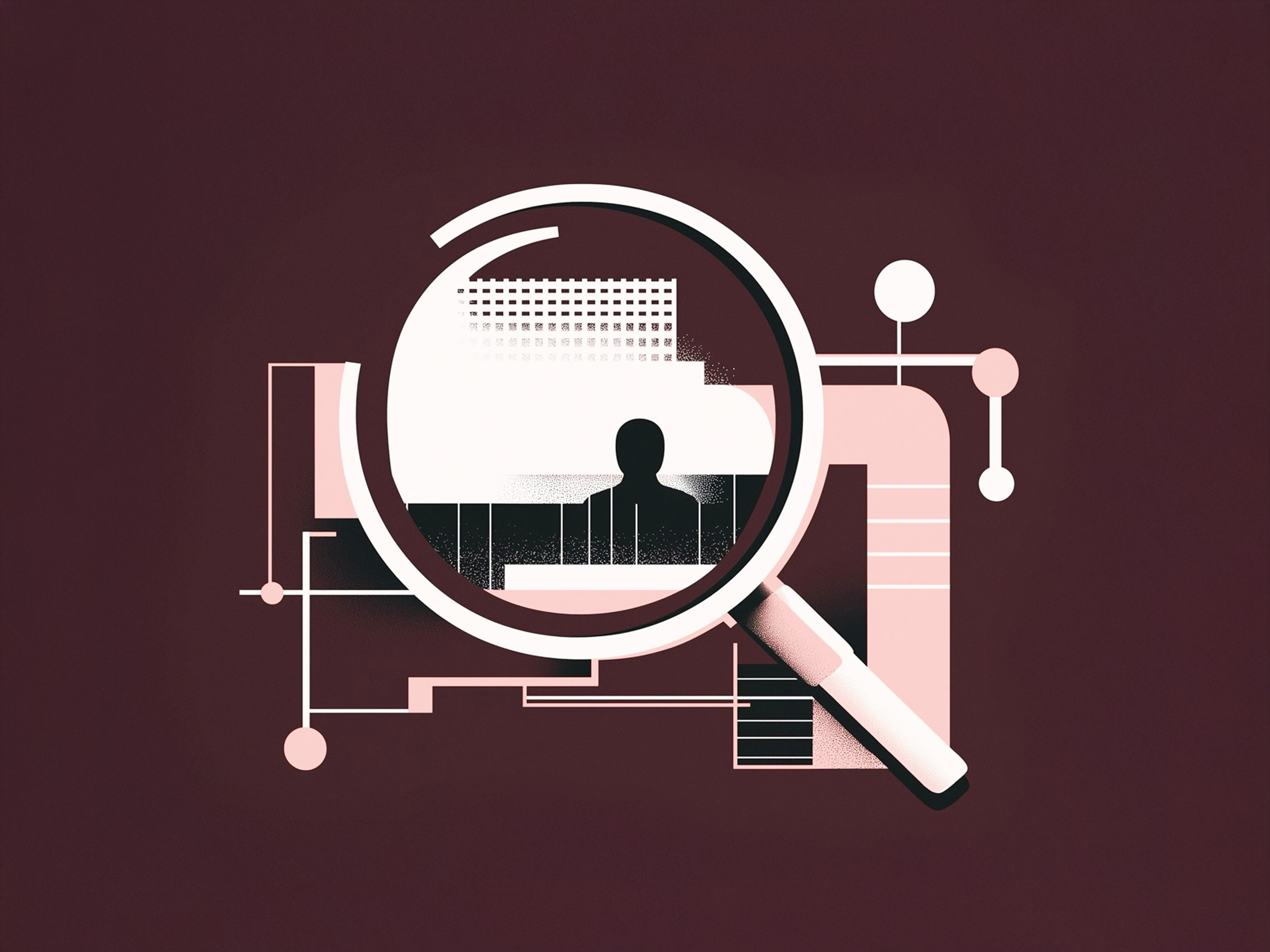
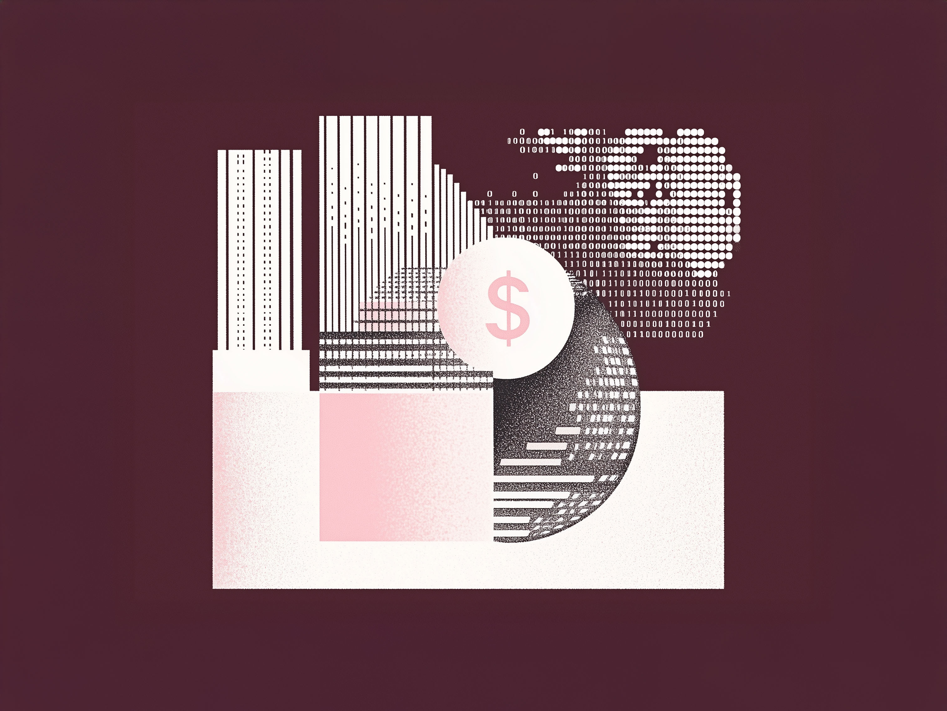
One night I got completely pulled in. I stayed up late tweaking, testing, refining the prompt. I added negative prompts to filter out things that didn’t match the tone—like overly prominent subjects or distracting color palettes. That’s when it clicked—the style finally locked in. Moody textures, soft gradients, and abstract forms came together into something that felt high-end, editorial, and unmistakably Wingspan.
It gave me a strong foundation to build from—something I could apply across formats without starting from scratch each time. With the look locked in, the next step was putting it to use.
Putting the System to Work
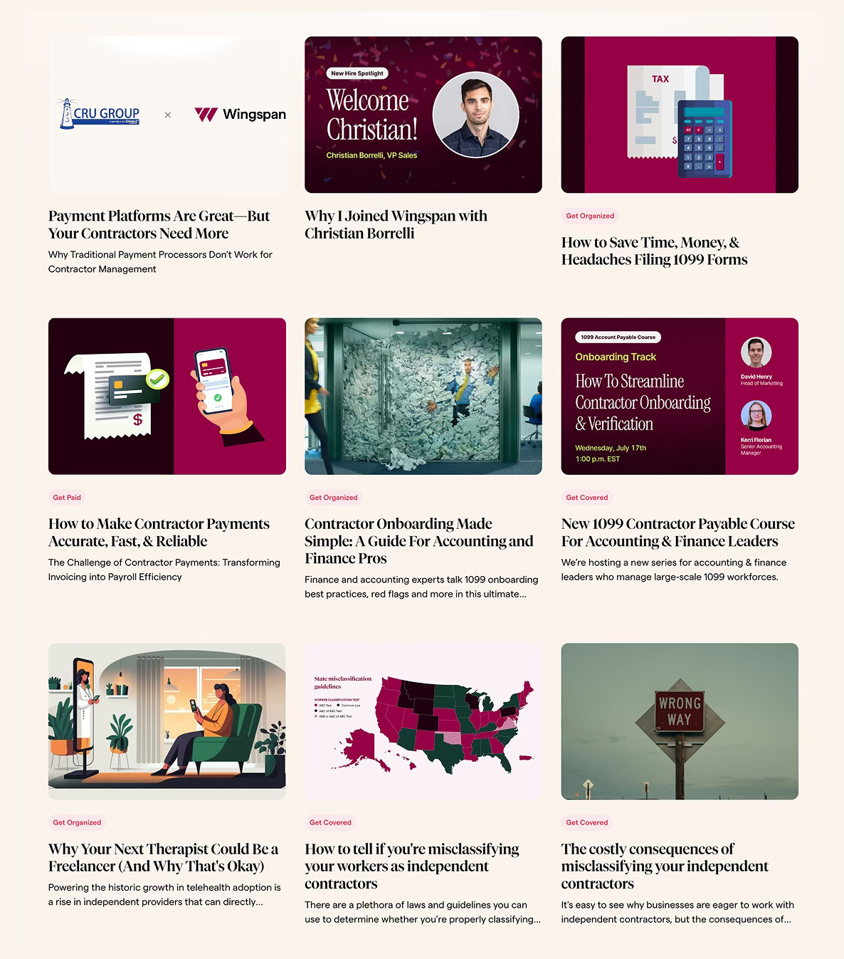
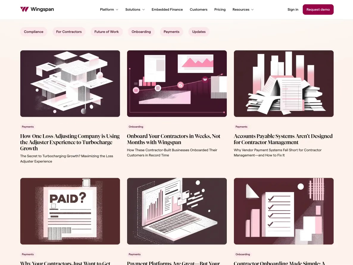
We started with the blog. It was a natural place to begin—there was a steady flow of content and a need for visuals that felt more aligned with the brand. With the system in place, I could create illustrations that matched the tone, looked cohesive, and gave each project a sense of intention without having to reinvent the wheel.
From there, the system expanded. It was used in campaigns, slides, and other content where visuals needed to support communication without feeling overly designed or off-brand. The illustration style became a common thread—not just for aesthetics, but for tone and clarity.
We didn’t need to overhaul anything as new needs came up, we just kept refining. The system was flexible enough to adapt, and focused enough to keep things feeling consistent. That ongoing refinement has been part of what makes it work. It’s a living system, not something fixed and frozen.
Because I’ve continued to create each asset, it’s been easy to maintain that through-line without slowing down the process. We’ve developed a rhythm that works: shared context, mutual trust, and a clear design direction that supports whatever the team is working on.


Independent, but Integrated
Even though I’m not on Wingspan’s team full-time, I’ve been the one creating all of their illustration assets. That kind of setup only works when there’s a shared understanding of the brand, a clear visual system in place, and good communication.
Because we invested the time up front to define the style together, it’s been easy to stay in sync. I can jump in quickly when something’s needed, and there’s no backtracking or guesswork. We’ve built a rhythm that allows us to move fast while still keeping everything on brand.
This kind of working relationship is becoming more common—and honestly, it works really well when you have the right structure in place. I’m able to stay close enough to the team to understand the context and goals, but I also bring an outside perspective that helps keep the visuals fresh and evolving.
What’s made it sustainable is the system. Instead of solving the same problem over and over again, we’re building on something that already has a foundation. That saves time, reduces decision fatigue, and gives the team confidence in how the brand shows up, without needing a big internal design department.


Design Systems Aren’t Just for Enterprise
Startups move fast. There’s always more to do than time to do it. And when you’re building a brand, it’s easy to focus on the big moments—the launch, the homepage, the product UI—and treat everything else as filler.
But all those “in-between” touchpoints matter too. The blog post illustrations, the email graphics, the decks—those are the things people see every day. When they’re designed with intention, they reinforce the brand. When they’re not, they quietly dilute it.
What we built at Wingspan wasn’t about making pretty images—it was about creating a high-end, editorial-style system that helped everything feel connected, thoughtful, and refined. A system that supports the team and lets them move fast without sacrificing quality.
I’ve worked in enough early-stage environments to know how hard that balance is. But I’ve also seen how tools are evolving—and how systems like this are more possible now than ever. You don’t need a big design team. You just need clarity, a good working relationship, and a structure you can build on.
When illustration becomes part of your brand system—not just a one-off execution, but a shared design language—everything gets easier.
It’s not about doing more. It’s about doing it smarter.
Good systems don’t replace creativity, they protect it. They give teams the space to move fast without losing themselves in the process.
Cheers,
Matthew